SharePoint Redesign 🏢
Six custom SPFx web parts built with Microsoft Graph, SharePoint REST APIs, and deliberate UX decisions to replace a static intranet with something people actually use.
December 29, 2025
How Do We Take a Boring SharePoint Homepage…
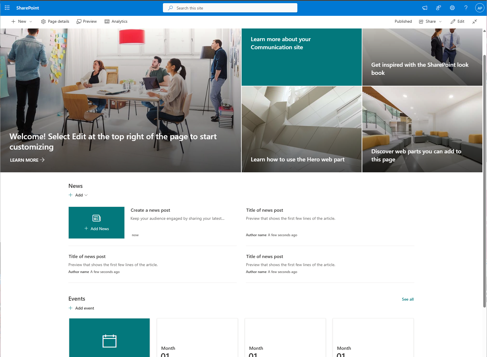
…and turn it into something interactive, engaging, and actually useful?
To accomplish this transformation, I built six custom SharePoint Framework (SPFx) web parts, all written in React + TypeScript, designed to work together as a cohesive homepage experience.
This article walks through each web part, the architecture behind it and the key code snippets that is the foundation of the web part.
Overview of the Six Web Parts
- News Web Part (hero section)
- Boxed Icons Web Part
- Praise Web Part
- Calendar Web Part
- HR Contact Web Part
- Feedback Web Part
All web parts:
- Use the SharePoint REST API
- Respect modern SharePoint page limitations
- Are configurable through the SPFx property pane
- Avoid hardcoded tenant or site URLs
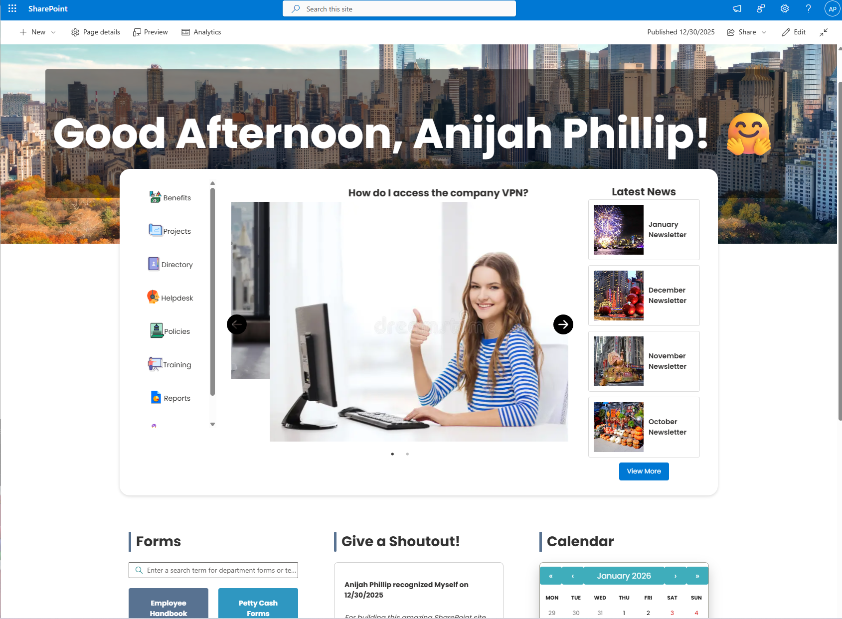
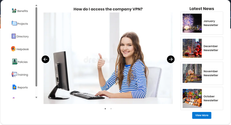
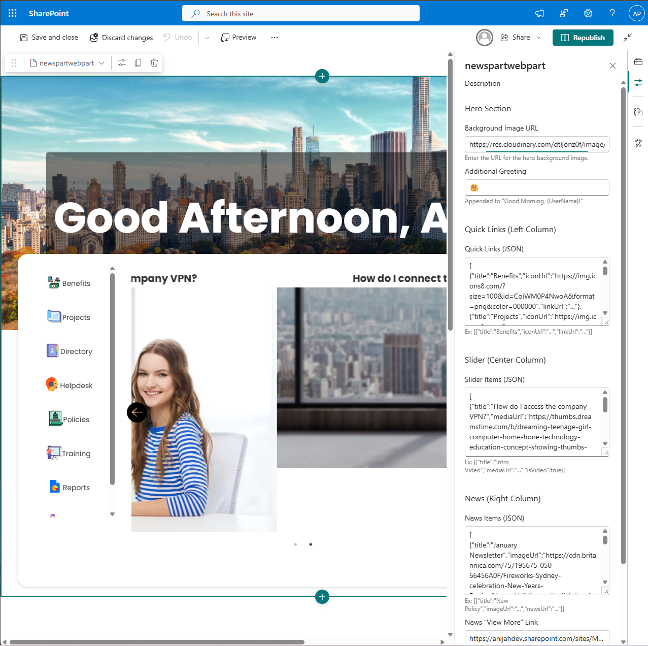
News Web Part (Hero Web Part)
The News Web Part is the main entry point of the homepage. It combines several UI elements into one cohesive experience:
- Clickable icon column (left)
- Slideshow / carousel (center)
- News summary column (right)
- Dynamic background image
- Personalized greeting
I started with a personalized greeting. The greeting automatically:
- Pulls the logged-in SharePoint user’s display name
- Adjusts the greeting based on time of day
- Supports a custom appendage (emoji or phrase) via the edit panel
I chose the "🤗" emoji, at my last job they opted for the "🌴" emoji. A nice island vibe.
While working in SharePoint Framework (SPFx) for all webparts I found myself in two files more often than others. The ".tsx" and ".ts" files. The ".tsx" file is where I built out the React components and ".ts" is where I coded the logic for the Property Pane where edits are made in Sharepoint.
For example, here is a code snippet of the Welcome greeting component:
Newspartwebpart.tsx
const defaultGreeting= () => {
const hour = new Date().getHours();
if (hour<12)
return `Good Morning, ${userDisplayName}!`;
else if (hour<18)
return `Good Afternoon, ${userDisplayName}!`;
else if (hour<22)
return `Good Evening, ${userDisplayName}!`;
else
return`Good Night, ${userDisplayName}!`;
};
Next I created a background image that would sit behind the greeting and partially behind the entire news-part. Creating a sleek banner effect. In the actual news-part, I split it into three columns that were all contained in a white box. The "quick links" column on the left, "slider" in the center column, and "news" in the right column.

Here is a code snippet of the hero container component:
Newspartwebpart.tsx
{/* Hero Container */}
<div className = {styles.dashboardWrapper}>
<div className={styles.heroContainer}
style {{backgroundImage: `url('${heroBackgroundImage}')` }}>
{/* Greeting Overlay */}
<div className={styles.heroOverlay}>
<h1>{fullGreeting}</h1>
</div>
</div>
{/* White box with the three columns */}
<div className={styles.contentContainer}>
{/* LEFT COLUMN: Quick Links */}
<div className={styles.leftColumn}>
....
</div>
</div>
{/* CENTER COLUMN: Slider */}
<div className={styles.centerColumn}>
....
</div>
{/* RIGHT COLUMN: News */}
<div className={styles.rightColumn}>
....
</div>
</div>
All of these components must be able to be edited in the Property Pane. This is where the .ts file comes in.
Here is a code snippet of the Property Pane:
INewspartwebpartProps.ts
export interface INewspartwebpartProps {
// Hero background + greeting
heroBackgroundImage:string;
greetingMessage:string;
// appended to "Good Morning, {UserName}!"
// Quick links (left column)
quickLinks: IQuickLink[];
// Slider items (center column)
sliderItems: ISliderItem[];
// News items (right column)
newsItems: INewsItem[];
newsMoreLink:string; // URL for "View More" }
NewspartwebpartProps.ts
publicrender():void {
// Parse quickLinks
let parsedQuickLinks: IQuickLink[] = [];
try {
parsedQuickLinks = JSON.parse(this.properties.quickLinks || '[]');
} catch (err) {
console.error('Error parsing quickLinks JSON:', err);
}
// Parse sliderItems
let parsedSliderItems: ISliderItem[] = [];
try {
parsedSliderItems = JSON.parse(this.properties.sliderItems || '[]');
} catch (err) {
console.error('Error parsing sliderItems JSON:', err);
}
// Parse newsItems
let parsedNewsItems: INewsItem[] = [];
try {
parsedNewsItems = JSON.parse(this.properties.newsItems || '[]');
} catch (err) {
console.error('Error parsing newsItems JSON:', err);
}
const element: React.ReactElement<INewspartwebpartProps> =  React.createElement(
Newspartwebpart,
{
description: this.properties.description,
isDarkTheme:this._isDarkTheme,
environmentMessage:this._environmentMessage,
hasTeamsContext:!!this.context.sdks.microsoftTeams,
userDisplayName:this.context.pageContext.user.displayName,
// Hero
heroBackgroundImage: this.properties.heroBackgroundImage,
greetingMessage:this.properties.greetingMessage,
// Quick links
quickLinks: parsedQuickLinks,
// Slider
sliderItems: parsedSliderItems,
//News
newsItems:parsedNewsItems,
newsMoreLink: this.properties.newsMoreLink
}
);
ReactDom.render(element, this.domElement);
}
Users will have to use JSON to make edits.
[
{"title":"How do I access the company VPN?",
"mediaUrl":"https://thumbs.dreamstime.com/b/dreaming-teenage-girl-computer-home-hone-technology-education-concept-showing-thumbs-up-39657528.jpg",
"linkUrl":"https://www.netgear.com/hub/network/security/what-is-a-vpn/"
},
{"title":"How do I connect to an office printer?",
"mediaUrl":"https://poa-media-cloud.s3.us-west-2.amazonaws.com/2024/04/ricoh_usa_multifunction_printer.webp"
}
]
This how it would look in the Property Pane.
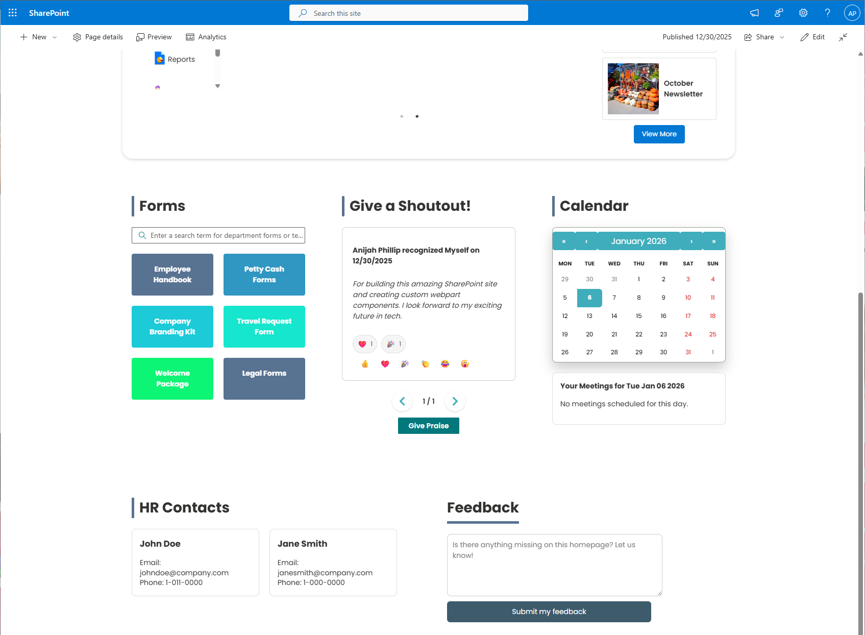
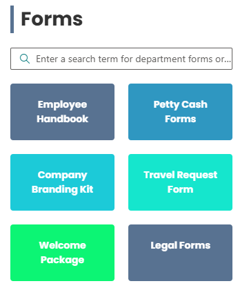
Boxed Icons Web Part
The Boxed Icons Web Part provides fast access to frequently used resources (policies, portals, tools, etc.).
Design Goals:
- Clean, clickable tiles
- Easily editable
- Reusable across pages
This webpart also has a search feature, which gave me trouble getting it to work. I debugged a lot and finally for the search function to actually look through the SharePoint's files.
Here is a snippet of the search function:
Boxedicons.tsx
const [searchTerm, setSearchTerm] = useState<string>("");
const [searchResults, setSearchResults] = useState<IIconTile[]>([]);
const onSearch = async (value:string) => {
setSearchTerm(value);
if (!value) {
setSearchResults([]);
return;
}
try {
const baseUrl = props.context.pageContext.web.absoluteUrl || "https://anijahdev.sharepoint.com/sites/MySharePointDesign";
// Build the endpoint URL for the "Site Assets" library.
// We use startswith(FileDirRef, ...) to return items from
the department_files folder and its subfolders.
// FSObjType eq 0 ensures we get only files.
// substringof('${value}', FileLeafRef) searches loosely for the term in the file name.
constendpoint=`${baseUrl}/_api/web/lists/getbytitle('Site Assets')/items?$filter=startswith(FileDirRef, '/sites/MySharePointDesign/SiteAssets/department_files') and FSObjType eq 0 and substringof('${value}', FileLeafRef)&$select=FileLeafRef,FileRef&$top=100`;
// Make the REST call using SPHttpClient.
constresponse = awaitprops.context.spHttpClient.get(endpoint, SPHttpClient.configurations.v1);
constdata = awaitresponse.json();
if (!data.value||data.value.length===0) {
console.error("No items found in department_files folder.");
setSearchResults([]);
return;
}
// Map returned items to your IIconTile interface.
// We use FileLeafRef as the title and FileRef as the link.
const results: IIconTile[] = data.value.slice(0, 8).map((item:any) => ({
title: item.FileLeafRef,
documentLink: item.FileRef,
tileColor: "#0078d4"// Default tile color; adjust as needed.
}));
setSearchResults(results);
} catch (error) {
console.error("Error searching department_files folder", error);
}
};
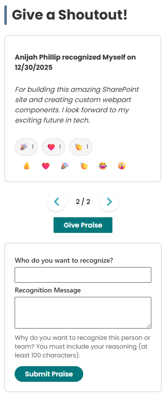
Praise Web Part
The Praise Web Part allows employees to recognize one another directly from the homepage.
This web part required the most engineering effort due to SharePoint’s strict REST rules.
The first step for this webpart is creating a SharePoint List. I called mine "Praise List". It is important to note the correct name of
your list and its columns because you will need it for the .tsx code.
Here is how I structured the columns:
Column ................................ Type
Title.............................................Single line text (Praise Giver)
PraiseReceiver............................Single line text
RecognitionMessage..................Multiple lines of text
Reactions.....................................Multiple lines of text
With the functions I created in the .tsx file each praise item is mapped into an object.
{
recognizer: item.Title,
recipient: item.PraiseReceiver,
message: item.RecognitionMessage,
date: new Date(item.Created).toLocaleDateString()
}
The Praise web part was by far the most complex component in this build. Unlike the other web parts, this one required both read and write operations, advanced state management, and multiple fallback strategies to handle SharePoint’s REST API behavior reliably.
This web part allows users to:
- Submit a praise entry through a custom form
- View praises in a rotating slider
- React to each praise using emoji-based reactions
- See reactions update in real time without page refresh
To support this, I implemented multiple interdependent functions responsible for:
- Loading praise items from a SharePoint list
- Submitting new praise entries
- Detecting whether reaction support existed on the list
- Toggling emoji reactions per user
- Persisting reactions safely back to SharePoint
- Polling items to confirm server-side updates
Because these functions rely heavily on shared state, list metadata, and runtime field detection, providing isolated code snippets would not accurately represent the implementation. Each function only makes sense in the context of the others.
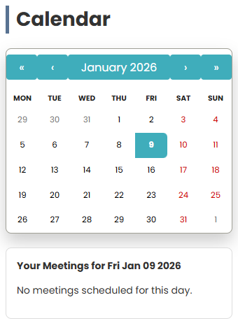
Calendar Web Part
The Calendar Web Part displays upcoming events in a simplified, readable format.
- Pulls from a SharePoint Calendar list
- Shows only upcoming events
- Formats dates cleanly for non-technical users
The Calendar web part integrates directly with Microsoft Graph to display the logged-in user’s daily meetings.
Rather than loading an entire calendar, I used the calendarView endpoint with a calculated start and end time to fetch only the events for the selected day. This keeps the query efficient and avoids unnecessary data transfer.
Timezone handling was a key consideration. Graph calendar events can return date strings without explicit timezone information, so I implemented a parsing helper and explicitly requested Eastern Standard Time to ensure meeting times render correctly for the user.
The calendar UI highlights days that contain meetings, and selecting a date dynamically reloads the relevant events without refreshing the page.
Here is a code snippet of the function that loads the calendar events.
Customcalendar.tsx
const loadUserCalendarEvents = async (date?: Date) => {
const client: MSGraphClientV3 =
await context.msGraphClientFactory.getClient("3");
const baseDate = date ? new Date(date) : new Date();
baseDate.setHours(0, 0, 0, 0);

const endOfDay = new Date(baseDate);
endOfDay.setHours(23, 59, 59, 999);

const query = `/me/calendarview? startDateTime=${baseDate.toISOString()}&endDateTime=${endOfDay.toISO String()}`;

const response = await client
.api(query)
 .header("Prefer", 'outlook.timezone="Eastern Standard Time"')
.select("subject,start,end,location")
.orderby("start/dateTime")
.get();

setUserEvents(response.value);
 };
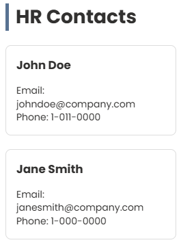
HR Contacts Web Part
This web part surfaces key HR contacts without forcing users to search directories.
- Clean card-based layout
- Supports photos, titles, and contact methods
The HR Contacts React component is intentionally kept presentation-only. It receives JSON data from the web part's Property Pane and focuses solely on rendering the UI.
Here is a snippet of the JSON parsing.
Hrcontacts.tsx
{contacts.map((contact: IHrContact, index: number) => (
<div key={index} className={styles.contactCard}>
{contact.photoUrl && (
<img
src={contact.photoUrl}
alt={contact.name}
className={styles.contactPhoto}
/>
)}

<div className={styles.contactInfo}>
<h3>{contact.name}</h3>
<p className={styles.jobTitle}>{contact.jobTitle}</p>
<p>Email: {contact.email}</p>
<p>Phone: {contact.phone}</p>
</div>
</div>
))}
Feedback Web Part
The Feedback Web Part allows users to submit homepage suggestions.
This webpart is similar to the Praise Web Part in that it involves a list being created.
Here is how I structured the columns:
Column ................................ Type
Title.............................................Single line text (Feedback submitter author)
Feedback....................................Multiple lines of text
Before submitting, the component validates user input to prevent empty entries. On submission, the logged-in user’s display name is automatically captured and stored in the list alongside the feedback message.
The web part uses SPHttpClient with the odata=nometadata configuration to ensure compatibility and reduce payload overhead. Success and error states are handled gracefully in the UI, providing immediate feedback to the user without requiring a page refresh.
Here is a code snippet:
Feedback.tsx
const submitFeedback = async () => {
setSuccessMessage("");
setErrorMessage("");

if (!feedbackText.trim()) {
setErrorMessage("Please enter some feedback before submitting.");
return;
}

const body = {
Title: context.pageContext.user.displayName,
Feedback: feedbackText
};

const endpoint =  `${context.pageContext.web.absoluteUrl}/_api/web/lists/getbytitle('HomepageFeedback')/items`;

const response = await context.spHttpClient.post(
endpoint,
SPHttpClient.configurations.v1,
{
headers: {
'Accept': 'application/json;odata=nometadata',
'Content-Type': 'application/json;odata=nometadata'
},
body: JSON.stringify(body)
}
);

if (response.ok) {
setSuccessMessage("Thank you for your feedback!");
setFeedbackText("");
} else {
setErrorMessage("Error submitting feedback.");
}
};
Final Takeaways
I wanted my company's Sharepoint to look better and be more interactive. This project also taught me about the real constraints in SharePoint. I also learned how to write defensive REST code. These webparts are maintainable and reusable.
If you have any questions or if you would like access to web parts please contact me. I am always available to discuss my code!